Every organization within all industries produces large amounts of data every day. This can range from customer data, financial data, and website metrics to Internet of Things (IoT) device data, among others. However, mere numbers may not always give any significance to your data. Inability to present and analyze information effectively renders data worthless in terms of its contribution to decision-making processes.
This is where Data Visualization comes in handy. Data visualization involves converting your data into simple graphical representations of information. Decision makers need not waste time decoding information from spreadsheets, as they would easily be able to obtain the necessary information from the graphical representation. In the wake of firms adopting a data-driven perspective, individuals who are capable of interpreting their data are of utmost importance.
In this article, we will discuss why Data Visualization is a vital skill for every Data Science student, its importance in decision-making, and how becoming proficient in the same would set you up for success in the current data-driven world.
What Is Data Visualization in Data Science?
Defining Data Visualization
Data Visualization refers to the conversion of data into a visual form of data presentation such as charts, graphs, dashboards, maps, and interactive reports. Rather than having to analyze large spreadsheet files and thousands of data points, it is easy to get insight into trends, patterns, and correlations in the data by looking at them visually. In data visualization in data science, it is not just about presenting data; it is about making complicated sets of data simple for understanding. Modern companies depend on Data Visualization to track their business performance, measure important metrics, identify any anomalies, and get insights to make strategic decisions.
Why Humans Understand Visual Information Faster
The brain is capable of processing visual information much faster compared to text or numbers. Charts designed with care can help you notice the patterns that may stay unnoticed in spreadsheets. For instance, if you draw a line chart, you will instantly see growth, and when using bar charts, you can compare categories easily. In other words, this skill helps make your decision-making process more efficient for companies, since you will no longer have to analyze your datasets yourself. Managers will be able to spot opportunities and track performance in changing conditions by looking at visual dashboards. This is why Data Visualization has become one of the most important skills in data science.
Why Data Visualization Is a Core Skill for Data Scientists
Data Analysis Is Only Half the Job
While data collection and analysis are just a single element of what a Data Scientist does, the true power of Data Visualization comes from making the insights understandable for the stakeholders to take action on them. The executives, clients, managers, and other people usually lack the know-how to understand the technicalities of the complex data sets and the statistical model. Hence, Data Visualization makes communicating technicalities much easier and enables businesses to make better decisions in shorter periods of time. That’s why Data Visualization has gained so much popularity.
Helping Businesses Make Better Decisions
Data Visualization is used by businesses to transform the collected data into insights that help them enhance their business performance. The sales department uses dashboards for sales forecasting, the marketing team analyzes the performance of marketing campaigns, the finance department monitors budgets and profitability, and customer analysis helps businesses understand the buying behavior of users. The operations department uses visual reports to optimize their business processes and discover inefficiencies. As businesses implement AI and analytics more, professionals who can effectively visualize insights are becoming increasingly relevant. In the programme brochure, it was stated that there are 100,000+ technology and data-related job opportunities available in Germany. There is high demand for expertise in AI, machine learning, analytics, and automation technologies.
Key Benefits of Learning Data Visualization
Makes Complex Data Easy to Understand
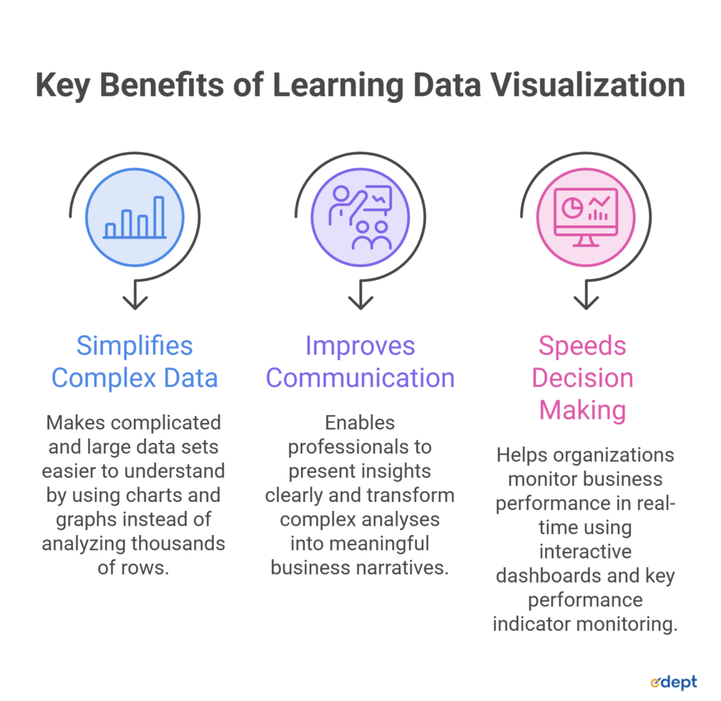
Amongst many other advantages, one of the most important advantages of Data Visualization is its capability of making complicated and large data sets easier to understand. In other words, without having to analyze thousands of rows in spreadsheets, professionals can simply observe charts and graphs to find any trend or correlation. With visual representation, information becomes easily understandable and thus less prone to being misinterpreted, which helps companies make informed decisions. This is why Data Visualization has become an essential part of data visualization in data science.
Improves Communication Skills
Strong analytical skills are valuable only when findings can be communicated effectively. Data Visualization enables data professionals to present insights clearly to executives, managers, clients, and non-technical teams. It also strengthens data storytelling by transforming complex analyses into meaningful business narratives that support informed decision-making. Professionals who can confidently explain data through compelling visuals often deliver more impactful presentations and collaborate better across departments.
Speeds Up Decision Making
Data Visualization is an important tool for modern-day organizations that helps keep a check on business performance in real-time. The use of interactive dashboards, key performance indicator monitoring, and executive reporting will help keep track of performance and risks as well as adapt in response to changes in the market environment. For example, Data Science tools like Tableau for Data Science and Power BI for Data Science can be used to build a dynamic dashboard.
As part of their Master’s in Data Science, students get practical training in Data Visualization & BI Tools (Tableau/Power BI) as well as Python, SQL, Business Statistics, and Machine Learning.
Popular Data Visualization Tools Every Student Should Learn
Tableau
Tableau is one of the industry’s leading Data Visualization platforms, widely used to convert complex datasets into interactive dashboards and business reports. With its drag-and-drop interface, users can work with data without the need for much programming, making it ideal for analyzing business performance and customer metrics. Having a good importance of visualization in analytics, the Master’s in Data Science and AI includes Data Visualization and BI Tools as part of the India-track curriculum. The students learn about these tools along with Business Statistics, Marketing and Consumer Analytics, and Research Methodology courses.
Microsoft Power BI
Microsoft Power BI is a leading business intelligence platform used by organizations to transform raw data into interactive reports and dashboards. Its seamless integration with the Microsoft ecosystem, including Excel, Azure, and SQL Server, makes it a preferred choice for enterprise reporting. Within the programme, Power BI is taught alongside SQL & Databases, Python Programming for Analytics, and Spreadsheet Modelling, enabling students to prepare, analyse, and visualise business data using industry-relevant workflows. This integrated learning approach helps students understand how data moves from collection to reporting in real business environments.
Python Visualization Libraries
The programme develops the ability to code through Python Programming for Analytics, Supervised and Unsupervised Machine Learning. It later expands it in the Germany track with modules such as Data Exploration & Analytics, Artificial Intelligence, and Research & Science Project. Students also gain practical exposure through innovation projects, internships in India, and company projects in Germany, allowing them to apply visualization techniques to real-world business and analytics challenges.
Excel and Google Looker Studio
For students beginning their Data Visualization journey, tools such as Microsoft Excel and Google Looker Studio provide an accessible introduction to reporting and dashboard creation. In the Master’s in Data Science & AI, this progression is reflected through modules including Spreadsheet Modelling, Data Visualization & BI Tools (Tableau/Power BI), Python Programming for Analytics, and Introduction to Data Management (SQL & Databases).
Types of Charts Every Data Science Student Should Know
Common Visualization Techniques
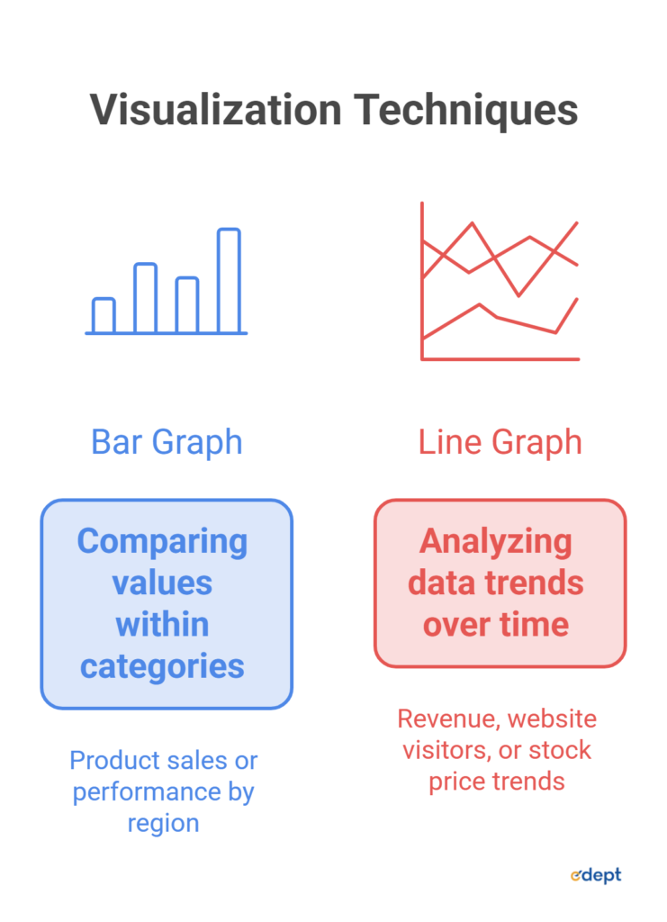
Choosing the right chart is just as important as analyzing the data itself. Different types of Data Visualization serve different purposes, and selecting the appropriate visualization helps communicate insights more effectively. A bar graph is used when it comes to comparing values within categories such as product sales or performance by region.
The use of a line graph is most appropriate in cases where there is a need to analyze data trends over time. Examples include revenue, website visitors, or even stock price trends. A scatter plot is used to show correlation between two variables. A pie chart is suitable for displaying proportions or percentage distributions when there are only a few categories. A histogram is commonly used to understand the distribution of continuous data, helping analysts identify patterns such as skewness or frequency. A heatmap highlights patterns through color intensity and is often used for correlation analysis, customer activity, or website engagement.
A box plot is useful for detecting data spread, identifying outliers, and comparing distributions across multiple groups. Meanwhile, geographic maps visualize location-based data, making them valuable for analyzing regional sales, population trends, delivery networks, or market performance. Knowing how and when to use these visualizations is a key Data Visualization skill. Not only does the correct chart help in clarity, but it also helps stakeholders understand the information and make appropriate business decisions, thereby making visualization an integral part of data visualization in data science.
Common Mistakes Beginners Make in Data Visualization
Avoiding Poor Dashboard Design
Data Visualization Learning is not only concerned with using software tools such as Tableau, Power BI, or Python packages, but also with the presentation of data in a manner that ensures people can grasp its meaning. Sometimes, even when the data analysis is correct, it can be poorly visualized. Some of the most common mistakes beginners make include:
- Using too many colours: Excessive colours distract the audience from identifying important information.
- Choosing the wrong chart: Using an inappropriate chart type hides patterns.
- Overloading dashboards: Trying to display every metric on a single dashboard often overwhelms users.
- Missing labels and titles: Charts should always include clear titles, axis labels, legends, and units so viewers can interpret the data correctly.
- Ignoring Context: Inconsistent or truncated axes can exaggerate or minimise trends, leading to incorrect conclusions.
How Data Visualization Improves Career Opportunities
Data Visualization Skills are highly sought-after skills in virtually every data-related job role. With companies increasingly using analytics to inform their decisions, there is a growing need for professionals who are able to turn data into meaningful and practical information. Indeed, the Master’s in Data Science & AI equips students with skills required in a number of such roles.
Roles That Require Visualization Skills
Whether you are analyzing business performance or presenting machine learning results, visualization helps communicate findings to both technical and non-technical stakeholders. Some common career paths include: Data Analyst: Creating dashboards, tracking KPIs, and identifying business trends. Business Analyst: Uses reports and visual insights for informed decision-making. Data Scientist: Explains analytical and complex findings through charts. BI (Business Intelligence) Developer: Builds interactive dashboards and reporting solutions. Analytics Consultant: Shows data-driven recommendations to clients using clear, easy-to-understand visuals.
Industries Hiring Visualization Professionals
Data Visualization is no longer limited to technology companies. Organizations across multiple industries depend on visual analytics to improve decision-making. Some of the leading industries include:
- Healthcare
- Finance
- Manufacturing
- E-Commerce
- Retail
- Automotive
- Technology
Conclusion
Technical expertise alone is no longer enough to succeed in today’s data-driven world. Employers value professionals who can not only analyze data but also present insights in a clear, meaningful, and actionable way. Strong Data Visualization skills bridge the gap between complex analysis and informed decision-making, making them valuable across industries and job roles. If you want to have a successful career as a Data Analyst, Data Scientist, Business Analyst, or a BI professional, then being able to visualize data will help you stand out from the competition. You should not think about Data Visualization as one more software ability; rather, it is a career skill that enriches your technical knowledge and problem-solving abilities.